reducing counsellor fatigue
overview
Webyapar Solutions was pitching their white label solution to a study-abroad consultancy facing rapid growth. As student volume increased, counsellors struggled with rising complaints around missed follow-ups, mistakes, etc.
My goal was to design an interface that solved the rising negative feedback.
// counselling is a holistic process
We tried to replace the counsellor
We formed an initial hypothesis: if we build a full automated CRM with automated shortlists, document sharing system, counsellors would become more efficient.
However, counsellors reacted strongly to this.
Shortlisting is where their expertise truly lives, and rigid automation risked flattening that judgment.
Similarly, document workflows weren’t linear - students and counsellors iterate frequently, and forcing repeated portal logins would introduce significant friction.
On top of that, the business deemed it risky to invest in maintaining a heavy SaaS system.
// Key insight:
This forced us to steer our assumption that it's a training or counsellor efficiency problem. Counsellors were skilled at their jobs, however, the friction came from something else.
counsellor interviews
To understand the root problem better, I moved to in-depth discussions with counsellors. I observed their working styles, calls, and tools to understand how they manage students.
The key insight from the discussions was the consultancy relied on a patchwork of disconnected tools since it started as a small in-house consultancy.
As the consultancy grew, the informal coordination systems that once worked - a WhatsApp message, a quick verbal update; become the biggest risk to student outcomes.
// Key insight:
Student data & lead management relied on verbal communication keeping counsellors from managing increasing volume.

// problem framing
how might we
Support counsellors in navigating student data, without disrupting the high-touch, iterative nature of counselling?
// the 4 pillars
design principles
With a clear problem statement in hand: I grounded the solution in three non-negotiable principles.
visibility
Make data easy to scan. A counsellor should know where each lead is at a glance.
Traceability
Counsellors should be able to get the student history without relying on memory.
efficiency
Minimize the time between a counsellor seeing an action vs following up.
single source of truth
key decisions
// 01 visibility
leads across stages at a glance
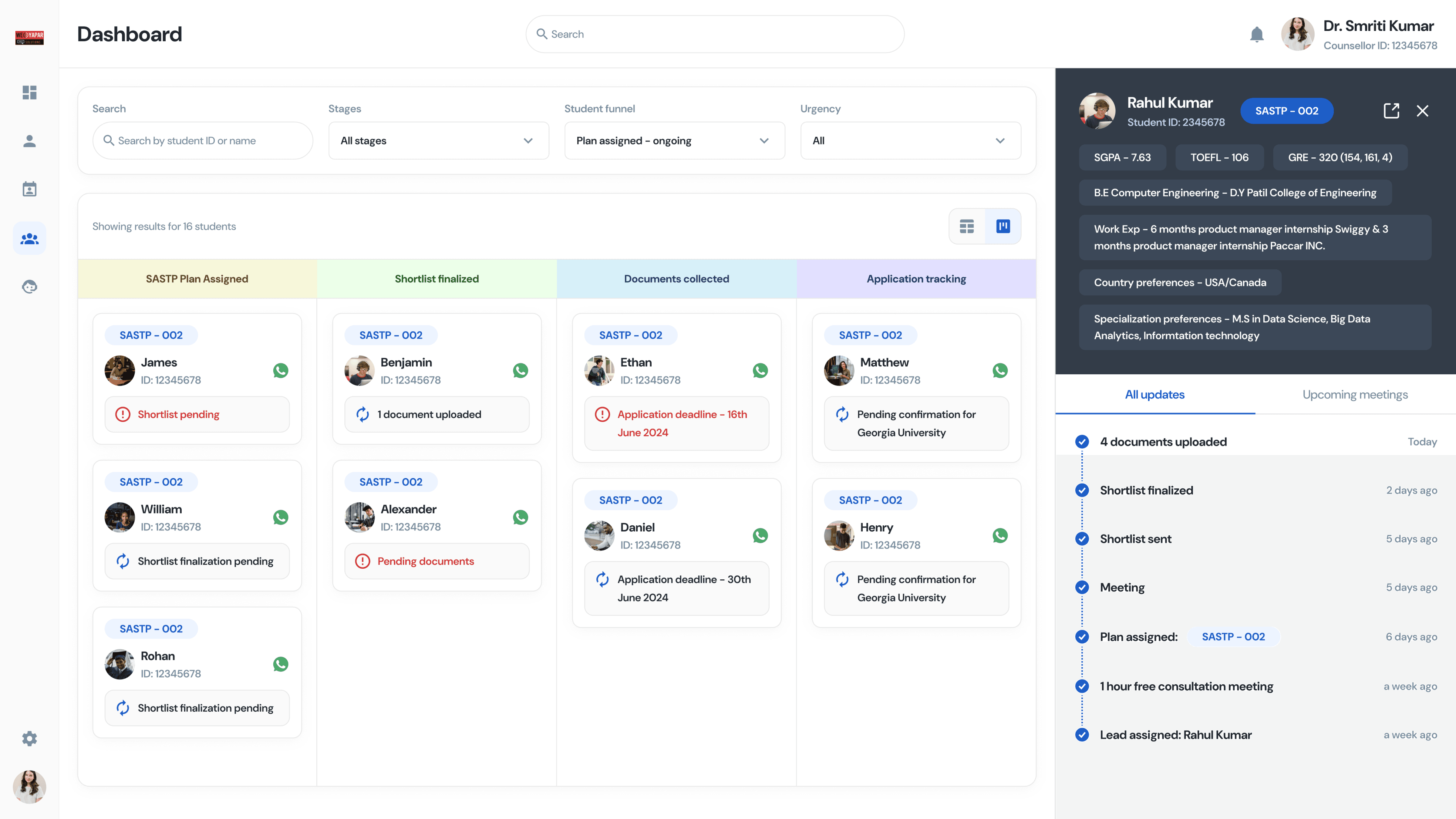
Designed a Kanban board to help counsellors quickly understand each lead’s status across four key stages - SASTP plan, shortlist, documents, and application tracking.

// 02 efficiency
follow ups
Each student card surfaced the last action a counsellor performed on a student & a WhatsApp outlink to the student's number.
Full-scale WhatsApp integration was deprioritized due to engineering overhead.


// 03 Traceability
minimizing context loss
Clicking a student in the dashboard opens a panel on the right - no new tab. The panel shows the student's academic profile and a full chronological history of every interaction.
A counsellor can answer "what happened last week?" in under 5 seconds, without losing their place in the list.

// dashboard
putting it together

// Document hub + persistent notes
One home
Since document sharing was deemed low impact due to the high iterative nature of editing between a counsellor & student, I instead pivoted to a document storage model.
Inside the student profile, a dedicated Documents tab lists every required file - SOP, Birth Certificate, Resume, GRE scores, Affidavit of Support, Visa.

Final Outcome
We ran role play sessions where counsellors were given realistic student tasks and were asked how confident they felt managing follow ups, lead tracking & managing student docs, etc.
We asked counsellors to rate their confidence on a scale of 1–5 before and after the new design. The average score went from 2.1 to 4.1.
We chose counsellor confidence as our primary metric because the core problem wasn't inefficiency. As student volume, counsellors weren't failing because they were too slow or incapable, they were failing because the information they needed didn't exist in one place.
Confidence was the most direct signal that the design had reduced that burden. If a counsellor felt certain about a student's status without digging through WhatsApp or relying on memory, the design had done its job.
Counsellor confidence increased by 2x
Amartya is exceptional at converting difficult concepts into useful user interfaces. Strongly recommended for large-scale SaaS projects.
-Mihir Barnwal (CEO Webyapar Solutions)
what i learned
The biggest learning here was recognizing when your initial direction is wrong - and being willing to abandon it. An automated CRM felt like the right answer before talking to users, but counsellor feedback revealed that automating the process would have removed the very human judgment that makes counselling effective.
This reframed how I think about automation as a design tool: it's most valuable when the task is repetitive and low-stakes. When the task requires expertise, relationship, and nuance - automation can quietly degrade the quality of the outcome.